
The Power of Color in Interiors
Color has the power to energize, inspire, and calm us, sometimes all at once. When coming up with designs for clients, I like to start with a neutral base. I let the impressions of the walls, ceilings, and trim exist in neutral color palettes because I find that most clients feel safest with a calm, neutral color, and it creates a grounded backdrop for the whole home. From there, I layer in bold, rich, deeply saturated hues through fabrics, furniture, art, and decorative accents. This approach keeps the space timeless and harmonious while still giving it personality and depth.
When I think of “bold,” I’m not drawn to loud primaries or overly bright colors. Instead, my eye goes to deep, saturated tones: navy, sapphire, forest green, burgundy, plum, muted ochres, and even dusty pinks. These colors feel grounded, luxurious, and quietly expressive, offering a richness that neutral palettes alone can’t always achieve.
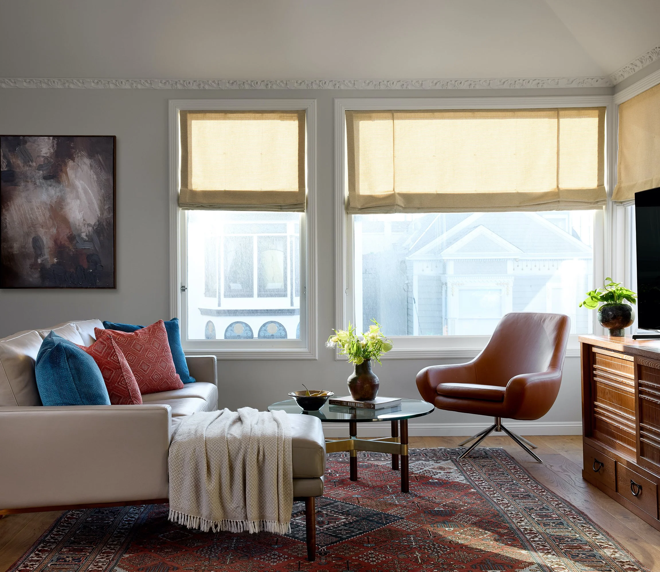
In my Hayes Valley project, this approach came to life in a new way. I went beyond my usual preference of working with three to four core colors and layered in more than four distinct palettes. Normally, that much color can risk feeling chaotic or becoming visually overwhelming, but in this room, it worked effortlessly. The richness of the hues paired with intentional textures, structured materials, and the existing architecture in the space created a living room that felt cohesive and serene. The deeper tones added personality and depth without compromising harmony. In fact, they created harmony.
This gravitation toward deeper tones shows up in many of my projects. In my Pacific Heights project for example, I intentionally leaned into a spectrum of rich reds. The client’s previous home already featured deep crimson accents, and it aligned beautifully with cultural symbolism. In many Asian cultures, red represents good fortune, vitality, and joy. By working within those tones, the home felt connected to the client’s heritage while still feeling elevated, modern, and refined.
Miss Alice Designs
Across all projects, I’m consistently drawn to color palettes with depth and richness because they lend warmth, character, and intention to a room. They help a space feel lived-in but refined, expressive yet grounded which is a balance I value deeply.
To help clients explore color, I pull inspiration from Pinterest, Houzz, design magazines, and imagery from my own archives. Seeing combinations in real environments helps clients imagine possibilities they may not have considered. It also gives us a visual language to discuss mood, tone, and emotional resonance.
From there, I create 3D renderings so clients can see exactly how colors, materials, and furnishings will interact in their specific space. It’s incredibly valuable. Suddenly, the abstract becomes tangible. The way the light hits the wall, the way a sofa’s fabric interacts with the rug, the way a bold hue shifts from morning to evening all becomes clear before any final decisions are made.
Physical samples are another essential part of the process. I bring paint swatches, fabric, tile, and finish samples into the home so clients can see how colors behave under natural and artificial lighting. Color is always changing and experiencing it in person gives clients confidence that their final palette will feel harmonious and intentional.
Most of my designs begin with a dominant background color that is typically a neutral base for the walls, ceilings, and trim. On top of this, I layer two to four (sometimes more) deeper or more muted tones through furniture, fabrics, or art. A contrasting accent color often adds depth and dimension. I usually use a rug to ground the room and give texture to create a calm foundation. This structure of having a neutral backdrop with layered richness, and an anchored base brings warmth and a sense of emotional ease to a space. It allows for bold color to feel elevated but not overpowering.
I don’t follow a rigid formula for pairing colors, nor do I rely on a signature palette. Instead, I draw inspiration from the architecture, the client’s personality, the feeling they want to evoke, and the references that capture our shared vision. When something resonates like an image, a painting, a textile, or even the quality of natural light in a room, then I explore that direction. Even when the tones are bold or saturated, my intention is always the same: to bring everything together so the final environment feels balanced, serene, and deeply personal.
The blank slate projects like Noe Valley and Hayes Valley highlight why this approach matters. Both spaces started as empty rooms, and by using a rich, layered palette this allowed them to come alive. Blues, greens, yellows, and moody tones made the spaces feel vibrant, expressive, and full of personality while still creating a soothing atmosphere at the same time. If either home had been designed in only shades of white, beige, greige, or gray, they wouldn’t carry the same warmth or identity. The deeper, saturated colors created character and a sense of luxury that neutrals alone couldn’t deliver.
Clients who embrace color often feel more inspired and at ease in their home. When the palette genuinely resonates with them, the space becomes an authentic reflection of their identity.
I’ve seen this firsthand. I once worked with a client who struggled to choose a paint color for her bedroom. She tested nearly a dozen swatches and disliked every single one. After we talked about how she wanted the room to feel, I suggested a color she hadn’t considered. I shared inspiration images, showed her how it would pair with her existing furnishings, and walked her through how the color shifts under different lighting. The moment she saw the sample in her space, she knew it was the right choice.
This experience is a reminder of why working with a designer is so valuable. Color is complex: undertones, lighting, proportion, psychological impact, and architectural context all matter. A designer sees the whole picture, not just the color itself, and how it behaves and shapes the entire experience of a room.
Ultimately, when color is chosen with intention, it creates harmony, grounding, and emotional connection. It becomes more than a design decision but a way of living in your home with clarity, comfort, and joy.
If you’re ready to begin your design project, schedule a complimentary 30-minute discovery call and take the first step toward creating a home that truly reflects you.. 👉 Click here to book your call