Luxury through proportion, intentional editing, and creating a home where every detail belongs..
Alice Chiu · October 2026
Miss Alice Designs
Restraint in luxury interior design is often mistaken for minimalism: fewer objects, neutral colors, and furniture with clean lines. But true restraint isn't about having less. It's about knowing what belongs, what matters, and how each element contributes to the whole.
A room can embrace rich colors, layered patterns, meaningful art, and distinctive furnishings while still feeling refined and inviting. The difference lies in how these elements relate to one another: the balance between bold statements and quieter details, the interplay of textures, and the space each piece is given to stand on its own.
Restraint is the art of knowing when to introduce something, when to build on what's already there, and when to stop. It allows a home's architecture, furnishings, and personal details to work together without competing for attention.
For me, this approach comes down to four principles: proportion, thoughtful editing, visual harmony, and warmth.
PROPORTION AND SPATIAL COMPOSITION
True luxury is not about having more. It is about getting every detail right.
One of the first things I consider when designing a room is proportion: how the size, shape, and placement of furnishings relate to the architecture. When the proportions are right, a room feels complete without needing anything more. Nothing overwhelms the interior, and nothing feels as though it's missing.
A sofa with a clean silhouette and soft curves, for example, can anchor a living room beautifully when its scale and form complement the architecture. Adding furniture simply to fill an empty corner or choosing artwork because a wall feels bare can disrupt the visual balance and make a space feel crowded. Giving each piece enough space to be appreciated allows its design, materials, and craftsmanship to stand out.
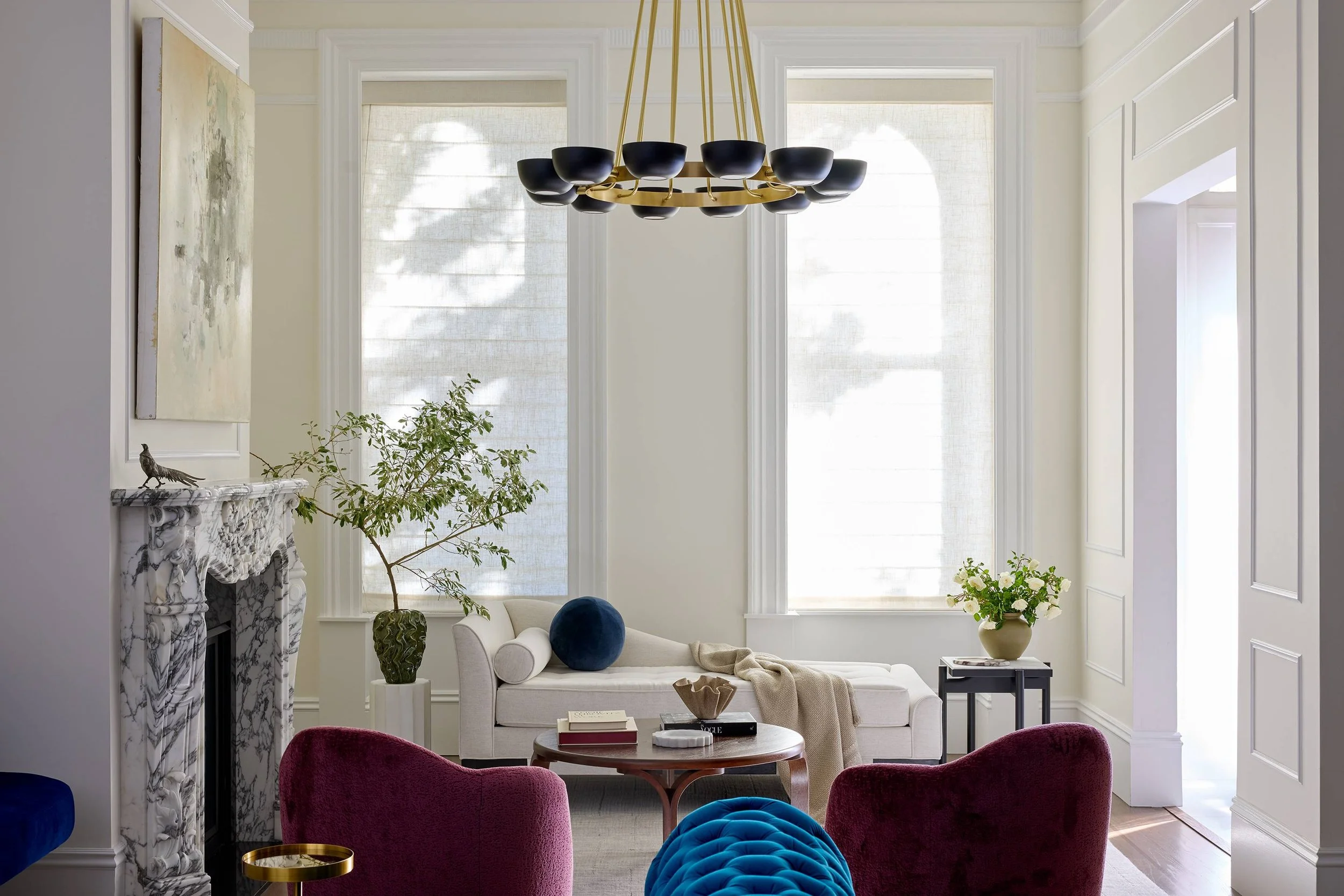
I also pay attention to how the eye moves through a room and whether the arrangement feels balanced or overwhelming. Tall arched windows, a striking fireplace, a sculptural light fixture, or an antique rug passed down through generations can each become a natural focal point. The surrounding furnishings should complement these features rather than compete with them.
Negative space is just as important as the furnishings themselves. An uncluttered wall or clear sightline can highlight architectural details and allow a beautiful piece to take center stage. These decisions also influence how comfortably people move through and experience a home.
Getting the proportions right allows architecture, furnishings, and open space to work together. Nothing needs to be added simply to fill a gap. The room feels harmonious because every element has its place.
THE ART OF EDITING
Editing is not simply about removing objects. It is about understanding what a room needs and what it doesn't. I consider the role each detail plays, whether it contributes to the overall composition, and whether it adds something meaningful to the space.
Subtle patterns can add interest without overwhelming a room, while stronger textures or unique finishes introduce contrast and depth. The key is balancing elements that catch the eye with those that create a sense of calm.
The same principle applies to accessories and artwork. A large, commissioned work of art may have all the presence a room needs, while a carefully arranged collection of objects can bring a coffee table or console to life. What matters is the scale, placement, and relationship of each piece to its surroundings.
In a room with strong architectural features, richly grained wood, or bold materials, simpler shapes and softer finishes can create balance. Conversely, a more understated space may benefit from a striking antique, abstract artwork, or artful piece of furniture.
Not every piece needs to stand out, and not every surface needs to be filled. The most successful interiors are often those where each choice feels deliberate, with elements working together rather than competing for attention.
Ultimately, intentional editing creates a home with depth and character, where the details feel collected rather than simply added.
BALANCE AND VISUAL HARMONY
Color creates visual balance in a room while adding warmth and dimension. Rich tones can define a space and make lighter features stand out. An olive green built-in cabinet can hold its own against expansive white walls, while dark floors or a muted purple velvet sofa can add weight to a room with high ceilings or a grand fireplace.
When developing a color palette, I consider how colors work with the architecture, furnishings, finishes, and accessories. I often begin with a client’s existing artwork, rug, or treasured objects to guide the design. A room doesn’t need to be limited to just two or three shades. Layering deep, saturated colors with softer neutrals can create richness and complexity. The key is understanding how the colors work together: which ground the room, which create contrast, and which tie the elements together.
In my Hayes Valley grand living room project, I layered five colors, ranging from bold shades to softer neutrals. Black accents in the sculptural chandelier add character, while the cabinet’s deep green echoes a shade in my client’s existing antique rug in the piano room. This subtle connection through color creates continuity between the two spaces and ties the palette together across the home.
Repeating select shades throughout the interior creates a sense of cohesion, while an accent color can draw attention to a particular feature. The goal is to bring color, architecture, and furnishings together so they complement one another while maintaining interest.
WARMTH AND SOPHISTICATION
A restrained interior should feel inviting and personal. Warmth comes from understanding the homeowner’s lifestyle, from planning spaces around their routines to incorporating meaningful touches that make the interior feel special. Sophistication comes from the thoughtful selection of materials and from the way these elements come together.
The furnishings, lighting, and details should support the way you live, rather than simply reflect the latest trends or a particular style. A beautifully designed home should feel as good to live in as it looks, with spaces that encourage people to gather, unwind, and enjoy everyday life.
In my Noe Valley project, I transformed a small, empty nook by the front windows into a comfortable retreat for my clients. A custom floating walnut bench with a velvet cushion and pillows made the most of the space, while custom drapery provided privacy. My clients love the nook so much that they use it every day, whether they're working on their laptops or taking a nap.
It's a simple example of how good design can transform an empty nook my clients weren’t sure how to use into one of their favorite places in the home. The custom details serve a purpose, the materials are well chosen, and the result reflects the way they actually live.
A home doesn't need an abundance of decorative elements to feel complete. Often, it’s how the design decisions work together that makes the greatest difference.
Ultimately, restraint is about making deliberate choices and knowing when to stop. It's about creating an interior where quality takes precedence over quantity, where beauty and function coexist, and where every piece feels as though it belongs.
That is the quiet power of restraint: creating a home that feels refined yet relaxed, reflecting your tastes, values, and individuality.
Considering a principal-led design experience for your home? Schedule a complimentary 30-minute discovery call to begin the conversation.
👉 Click here to book your call.